In a modern mobile world your website needs to be developed using Responsive Web Design - an approach which gives an optimal viewing experience across a wide range of devices from desktop monitors to mobile phones.
So when a visitor arrives at your site on mobile they will not need to stretch or zoom their screen to view your page.
And with increasing numbers of us opting for multiple devices to access the web this amplifies the need for responsive design.
There are definite business advantages, as stats indicate that non-responsive sites fall behind:
+ People are genuinely turned-off by sites they struggle to view on mobile devices
+ E-Commerce sites find a tail-off of users on mobile devices, exiting sales early
+ Responsive websites increase conversion to sales
+ Plus lets face it, responsive web designs look great!
Case Study - Quartermile
A full featured responsive web design, for desktop, tablet and mobile users
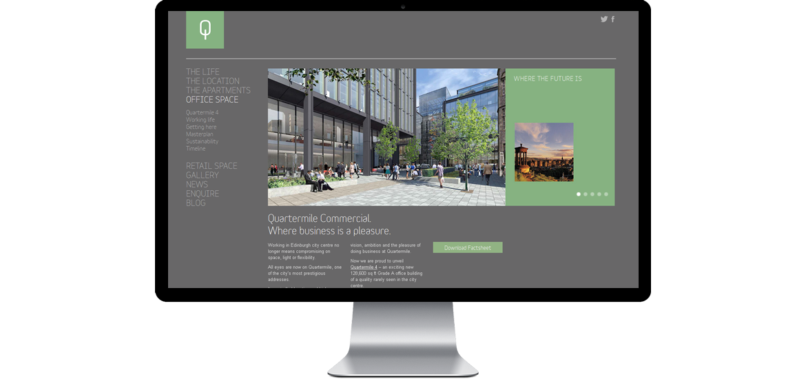
Quartermile sales and marketing teams required a tablet-ready fully responsive website design, presenting three elegant layouts for desktop, tablet and mobile visitors
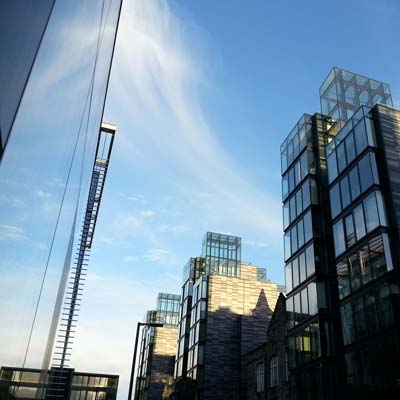
Quartermile is one of Scotland's largest urban regeneration projects, involving the redevelopment of the former Edinburgh Royal Infirmary into 900 apartments. Designed by renowned architects, Foster + Partners it is an award-winning landmark development, comprising both residential and commercial property.
We've been responsible for the technical development of this website since 2006, working with the creative agency's outstanding artwork and designs.
Since 2006 the Quartermile website has been through several major re-developments, each presenting new challenges and requiring many bespoke enhancements both in visual presentation and back-end administration, for reflecting apartment sales for example.
It's been a pleasure to work on this project which is continually evolving and developing.
 appscotland
 linkedIn